The science of climate change presents, with no doubts, worrying reports (as the recent data on CO2 in atmosphere, monthly temperature, Arctic sea ice, acidification of the oceans).
The good news is that we do not have just one future in front of us, but we can still make our choices.
There are several possible futures. Scientists call these “scenarios”, and here we are going to present three of them, taking inspiration from the spiral method of monthly anomalies, originally developed by Ed Hawkins for HadCRUT data. …
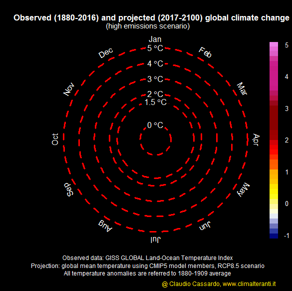
After displaying the observed temperature from 1880 to 2016, the first scenario shows, the projection of global average temperature of the atmosphere from 2017 to 2100 (data taken from CMIP5 simulations on this site), in case we will continue to emit uncontrolled greenhouse gases into the atmosphere. This is the “Business as usual scenario”, also called “Disaster as Usual”, and technically known as RCP 8.5.
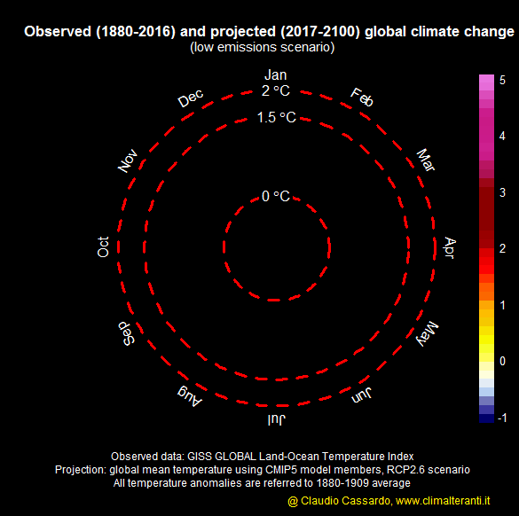
In the second scenario, we see how the temperature of the planet could evolve if we would act with determination and courage in order to quickly reduce greenhouse gas emissions. We have defined this, known as RCP 2.6, as “low emission scenario” (data taken from CMIP5 simulations on this site):
In the third scenario, we are seeing a future in which we will take some counteractions, but too late and in a way which is insufficient to significantly reduce the growth of greenhouse gas emissions. This is the scenario RCP 4.5 (data taken from CMIP5 simulations on this site) that is where the current international negotiations on climate will bring us.
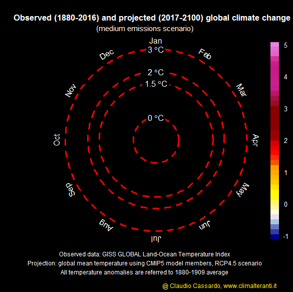
In all these cases, the observed temperature (1880-2016) has been extracted from the GISS database (available here), that collects the anomalies of global mean temperature. In the three animations, the white thick line appearing at the end represents the anomaly recorded from January 2015 to April 2016. All the temperature anomalies are referred to the 1880-1909 average.
It is possible to see very clearly how the world that we will provide to the future generations, if we will keep doing nothing, would be very different from the one in which we would live acting with determination, courage and rapidity. While until 2025-2030 all the three scenarios are showing a similar gradual increase in temperature (take a look also at another type of animation, in this blog), afterwards the differences between the scenarios become more and more noticeable, and huge at the end of the century. The more time passes with no action, the more the tendency moves towards the first scenario… leaving increasingly narrow margins to change pathway and to remain in the “milder” scenario. We define this “milder”, but it will anyway make appearing globally warm periods, like the last four months (that were literally destroying Arctic ice) as cool periods.
Science should not decide which scenario needs to be chosen among the ones presented. Scientists can suggest what to do in order to achieve them, what are the costs and the benefits, the uncertainties. Nevertheless the decision could (or should) be taken by all the inhabitants of the planet, through their political representatives.
The choice may seem obvious, but unfortunately it is not, at all. Behind every scenario there are further choices, linked to technologies, resources, behaviors. Each scenario has implications, actions at any level, decisions of the international negotiations, investment choices, administrative decisions, and individual behaviors.
These animations show that it is important to make our choises.
Article of Stefano Caserini and Claudio Cassardo
Animations made by Claudio Cassardo, with the collaboration of Stefano Caserini


Two examples of the first reactions of the Earth’s climate system to out-of-scale anomalies in recent months can be seen by looking at the actual extent of Arctic ice:
http://nsidc.org/data/seaice_index/images/daily_images/N_stddev_timeseries_thumb.png
always below the envelope curve relative to previous years, and also looking at the level of current CO2 concentrations:
http://www.esrl.noaa.gov/gmd/ccgg/trends/global.html
which shows values higher than in the other years, not only in absolute (this normally happens every year …) but also as a trend, which is increasing. There is a serious risk to not see a month (the likely candidate is August, usually the month with the lowest concentration) below 400 ppm.
It is thus possible to imagine what might be the consequences of the expected warming even by the milder RCP 2.6 scenario, which in any case will continue to warm atmosphere until the middle of the century, and then will stabilize. If, instead, the RCP 8.5 scenario will be what we’re going to follow, well I am afraid that, in 2100, the survivors will see a very different world from this one…
Somebody told me – privately – that some acronyms are not adequately explained. In particular:
RCP – Representative Concentration Pathways: they are four greenhouse gas concentration (not emissions) trajectories adopted by the IPCC in its fifth Assessment Report (AR5, 2014). The pathways are used for climate modeling and research, and describe four possible climate futures, all of which are considered possible depending on how much greenhouse gases are emitted in the years to come. The four RCPs, RCP2.6, RCP4.5, RCP6, and RCP8.5, are named after a possible range of radiative forcing values in the year 2100 relative to pre-industrial values (+2.6, +4.5, +6.0, and +8.5 W/m2, respectively). More details in this site (http://link.springer.com/article/10.1007/s10584-011-0148-z).
CMIP5 – Coupled Model Intercomparison Project Phase 5, see this site (http://cmip-pcmdi.llnl.gov/cmip5/) for details.
GISS – the acronym means (NASA) Goddard Institute for Space Studies, but in this case refers to the GISS Surface Temperature Analysis (GISTEMP): more details on this site (http://data.giss.nasa.gov/gistemp/).